‘A picturesque European village’
An architectural review of UTSA’s Main Campus
January 24, 2023
Rating: 3 stars
UTSA’s Main Campus has quite a storied history, despite its monolithic nature and its relatively young age.
At first glance, the campus seems more functional than aesthetic. The campus was made to accommodate a growing student body, which has now reached over 34,000 ‘Runners. It is a compact campus, notwithstanding the stairs. As such, our somewhat non-aesthetic campus is complemented by the burgeoning student body.
With regards to the specific history of the campus, the John Peace Library, McKinney Humanities, Bosque Street Building, Intercollegiate Athletics Building, Flawn Sciences Building, the Arts Building and the Convocation Center were the first few buildings finished in the early 1970s. The age of these structures is clear since they are arguably the most architecturally similar buildings on campus.
What is obvious for any student, or really anyone who has visited UTSA’s campus, is the Sombrilla’s role as the center of campus. For the architect Milton Babbitt, it was “the nicest non-building” he designed. Babbitt took many cues from historic Spain when designing the campus. A majority of the architectural inspiration came from “a picturesque European village.” In particular, was the density of the campus and how he intended on having a plaza in the center with various paseos or walkways leading students to it.
O’Neill Ford, a colleague of Babbitt’s and the main architect of the campus, came up with the “hanging sticks.” This is what Babbitt used to refer to as the hanging wooden panels that make up the Sombrilla’s covering. Then there is the fountain, which was almost not built. Ford and Babbitt wanted two fountains. Peter Flawn, the President of UTSA from 1973 to 1977 and the Flawn Building’s namesake, wanted none. He felt that people would think that the university was spending too much money on its building. Eventually, Flawn compromised and allowed one fountain.
Milton Babbitt kept functionalism in mind for the campus when discussing the social context of the popular architecture of brutalism at the time. Brutalism emerged after World War II, and was based on functionalism and had large buildings. Hence, even Babbitt himself acknowledged the fact that on-campus buildings were “formidable.” However, notable examples of architectural functionality are the various pillars around campus — they can be seen mostly in the Sombrilla. They have served an aesthetic and practical purpose in architecture across cultures for millennia. For UTSA, they contain various services and utilities. Babbitt saw the need for an easily expandable campus.
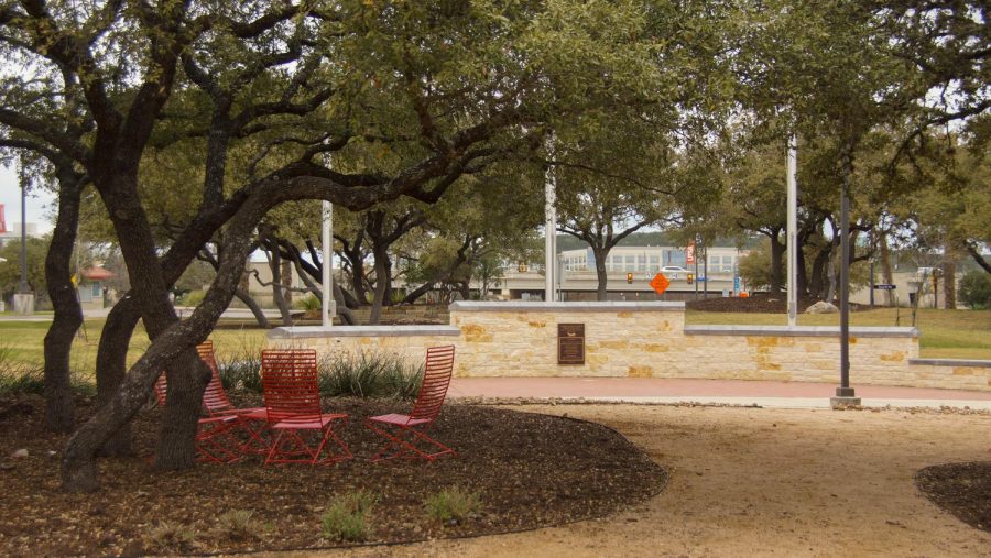
The UTSA Main Campus also has many other small details that must be appreciated. The trees dotted across campus had the students in mind when Babbitt wrote the master plan.
“Landscaping plans call for live oak trees so students can sit in the shade in summer and deciduous red oaks so they can sit in the sun in winter,” the document reads.
In addition, the concrete that the buildings are made of is native to Texas. The beige color of the concrete was chosen as it helped the campus blend into its surroundings. There was a possibility that the concrete would be grey rather than the beige it ended up being — something that the architects were happy about.
It was a shock to see all the history that was involved in making this campus. I am always inspired by “new” campuses — those that were built in the last 50 or so years. They were built with a certain idealism in mind: to be different. Their focus was not necessarily on aesthetics, but on usability for the ease of students. As for UTSA, the architecture’s functionality has been maintained. The campus is walkable — you can easily get to all of the buildings on foot, due to the compact building placement. Cars are limited to parking lots and garages on the outskirts of campus. The most important piece of architecture is the Sombrilla. It has remained the focal point of campus for the last five decades and will likely remain so.


